Guide Trading Assets/ Chart Type/ Indicators/ Drawing at Pocket Option
Writen By
Online Trading Platform Researcher and Guide Writer
Researches broker platforms and trading account Systems.
sdf

Choosing a Platform Language
In order to change the language on the platform, click on the flag sign in the top right corner of the trading interface and choose the preferred language.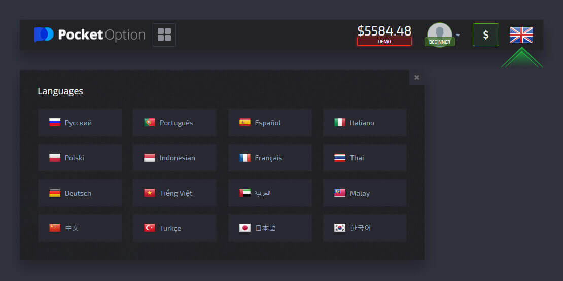
Please note that the language of incoming messages, support requests and chats depends on the website language settings.
Attention: It is also possible to set the language in the Profile settings.
Switching a Platform layout theme (light/dark)
Pocket Option trading website is offered in two different color layouts: light and dark. To switch the Platform layout theme, locate the “Settings” menu by clicking on your avatar in the upper panel of the trading interface and enable the light theme.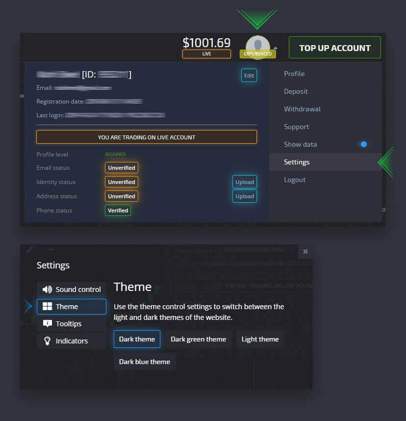
Multiple charts display
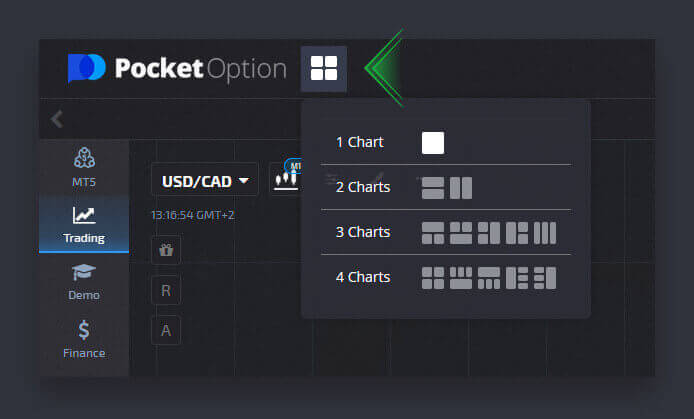
For simultaneous trading on several currency pairs, you can display from 2 to 4 charts for your convenience. Please pay attention to the button on the upper left of the screen next to the platform logo. Click on it and choose among several chart layouts.You can always switch to using several browser tabs if you prefer.
Trade panel position
The main trading panel is by default located at the bottom of the trading interface. You can adjust the position of the trade panel when you click on a small arrow sign in the upper left corner.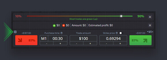
Trading assets
You can choose among over a hundred assets available on the platform, such as currency pairs, crypto currencies, commodities, and stocks.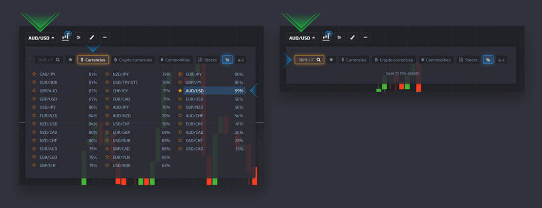
Choosing an asset
Choose an asset by category or use an instant search to find a necessary asset: simply start typing in the asset name.
Adding an asset to favorites
You can add to favorites any currency pair/cryptocurrency/commodity and stock that you need. Frequently used assets can be marked with stars and they will appear in a quick access bar at the top of the screen.
Chart type
There are 5 chart types available on the platform, that is Area, Line, Japanese Candles, Bars, and Heiken Ashi.Area chart is a tick chart type that represents a fill area where the you can see the real time price movement. Tick is the minimum change in price and there can be several ticks per second viewable with a maximum zoom.
Line chart is similar to the area chart. It is also a tick chart showing the real time price movement, but in a form of a line.
Candlestick chart indicates hight-to-low range of a price movement in a specific timeframe. The body part of the candle shows the range between the open and the closing price. Whereas, the thin line (candle shadow) represent the maximum and minimum price fluctuation within the candle lifetime. If the closing price is higher than the open price, then the candle will be colored green. If the closing price is lower than the open price, then the candle will be colored red.
Bar chart is similar to the candlestick chart as it also shows the open price, the closing price, and high-to-low range. The little horizontal line on the left indicates the open price, the one on the right is the closing price.
Heiken Ashi chart is indistinguishable from Japanese candle chart at first glance, but Heiken Ashi candles are generated with the help of a formula that allows to smoothen out the noise and price fluctuations.

Choosing the chart type
You can set up the chart type on the upper left of the trading interface.
Setting up a chart timeframe
You can set up timeframes for such chart types as Candles, Bars, and Heiken Ashi. Available options are listed below upon choosing a timeline chart type.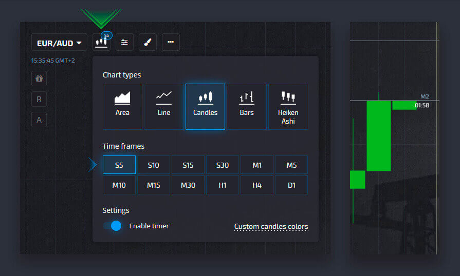
Enabling a candlestick/bar timer
A timer is a useful feature which displays a candle/bar lifetime on the chart. In order for timer to be displayed when making a trade, click on the “Enable timer” button in the chart settings.
Setting custom candlestick/bar colors
If you want to stick out and adjust the platform to your liking, you can set a custom candle or bar color in the Chart settings.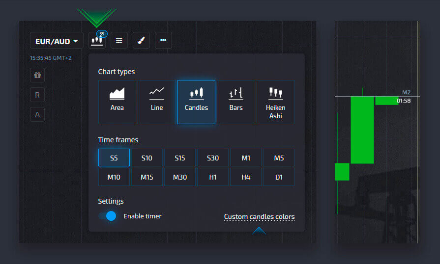
Indicators
Indicators are mathematically-based tools of technical analysis that help traders predict the price movement and the prevailing market trend.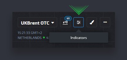
Enabling an indicator
You can select indicators of technical analysis in the “Indicators” section, which is located on the upper left of the trading interface (next to the asset selector).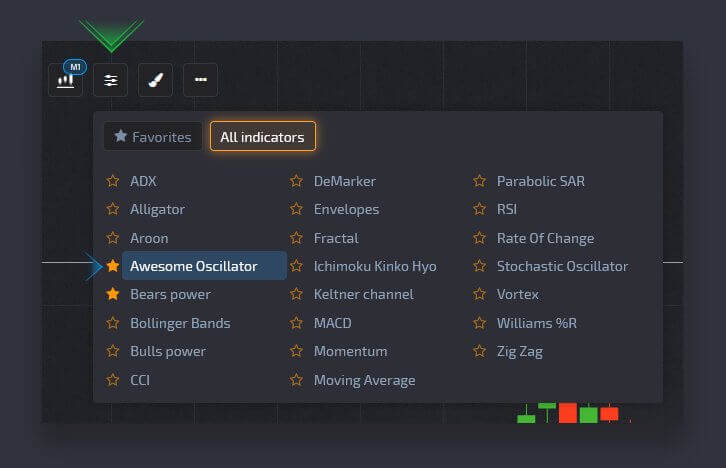
Tuning indicator settings
Each indicator has its own settings such as period, type, thickness, color, etc.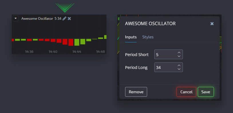
Removing an indicator from the chart
In order to remove an indicator from the chart, open the indicator bar on the upper left of the trading interface, select the “Current” tab and click on the “X” button next to a specific indicator.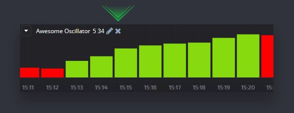
Drawings
Drawings are also tools of technical analysis that are basically lines and geometric shapes that can be drawn on the chart or indicators. Drawings can be saved for each asset separately.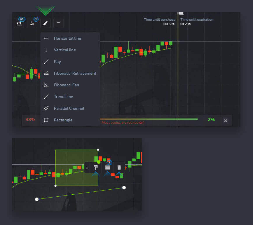
Adding a drawing to the chart
Drawings are used for chart analysing as well as help to visually distinguish trends and market access points. The drawings menu is located at the top of the trading interface next to the chart types and asset selector:
Removing a drawing
To remove a drawing from the chart, open the drawings tool on the upper left of the trading interface, select the “Current” tab and click on the “X” button next to a specific drawing.


